
Why are you introducing a commemorative logo for your 150th year? What was the brief?
The brief was to develop a commemorative logo to celebrate the Club’s 150th year anniversary.
In doing so, elevate the Port Adelaide brand nationally, and use this opportunity to share the 150-year story of the Port Adelaide Football Club.
We wanted to create a design which was specific to our 150th year.
To be authentic we felt as if we needed to represent the club’s entire history.
We acknowledge the Power logo has been an important part of the club since 1997 but to truly celebrate and acknowledge our history dating back to 1870, we needed to unite both the Magpies and Power brands into one Port Adelaide logo.
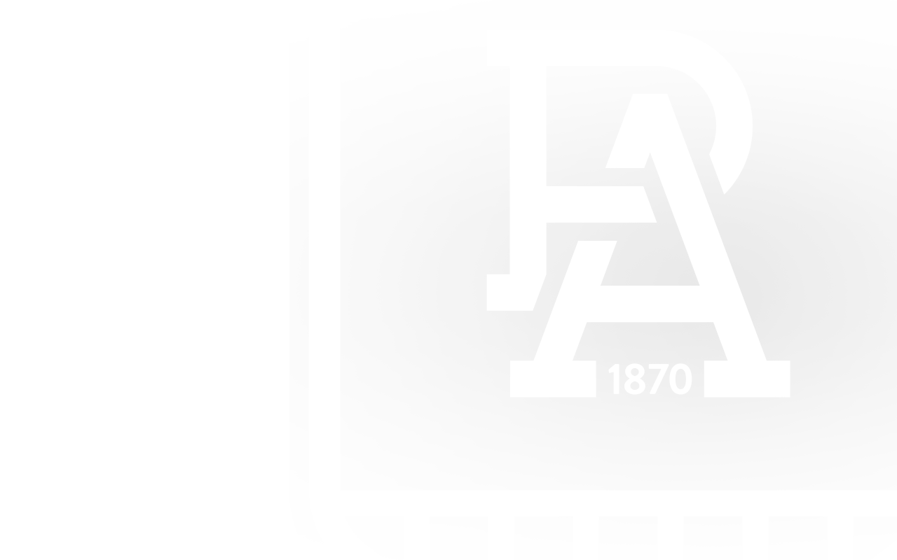
We believe our 150th anniversary logo captures every key element of Port Adelaide – the PA representing Port Adelaide; the black-and-white stripes representing our treasured Prison Bar guernsey; 1870 acknowledging our formation year; the chevron design of our current AFL guernsey; and the teal representing the modern Port Adelaide in the AFL.
One of the major objectives is to bring our club and community together in our 150th year under a unifying identity in 2020
What was the design process for the logo?
There was a detailed agency pitch and selection process to identify the agency that best understood the brief and our story as a club.
The process included investigating the scale of options for a logo – from historic – to familiar – to modern.
We then tested it with key stakeholders and focus groups to identify the non-negotiables and key assets.
It was an exhaustive, collaborative process that took nearly two years from start to finish. We engaged a number of key stakeholders – our players, former players at both AFL and SANFL level, supporter groups, staff, Board and the AFL.
There was a thorough agency pitch process which led to the selection of AFL Media to work with the club’s brand & marketing committee on the development of the logo.
In this process, there was significant research which highlighted the challenge for us. There is no other sports team anywhere in the world, that has been strong and established as one brand, then separated into two, and then united again as one brand. It highlights the uniqueness of the Port Adelaide story and made the process a significant challenge.
AFL Media have been working with our club’s Brand and Marketing committee for several months on an extensive process that has led to this final product.
The Challenge?
Bringing together two iconic brands, both with significant value and emotion was a major challenge and consideration.
No precedent with any sports organisation anywhere in the world could be used as a case study.
What were the guiding principles?
- Who is the logo for? – it is for our people; they need to love it and wear it as a badge of honour
- Balance and Future – the logo is as much about looking forward and into the future. Port Adelaide has always been about what’s next – the next win, the next Premiership or the next challenge
- The logo has to be authentically connected to where we’ve come from. It has to be authentically Port Adelaide. We can’t pretend to be something we are not – it has to be familiar
Will this logo be permanent?
The intent is for this to be a commemorative 150th anniversary logo to be used in 2020 only
Where will the logo be seen?
Everywhere. For 2020 this logo will replace the Power and Magpies logo in every execution. The logo will feature on our building, website, letterheads and most significantly our AFL and SANFL guernseys. This is our one club logo for 2020.
What now for the Magpies and the Power?
The Magpies and Power nicknames will remain a part of Port Adelaide. Our SANFL team will continue to wear the black-and-white prison bars in 2020 and will be called the Magpies, while our AFL team will still be called the Power. Our club songs won’t change. All that has changed is we have introduced a one club logo to unite the Magpies and Power under the one Port Adelaide banner for our 150th year.
